What Makes A Quality Sign?
- Jun 18 2019 1:14 PM
- signs
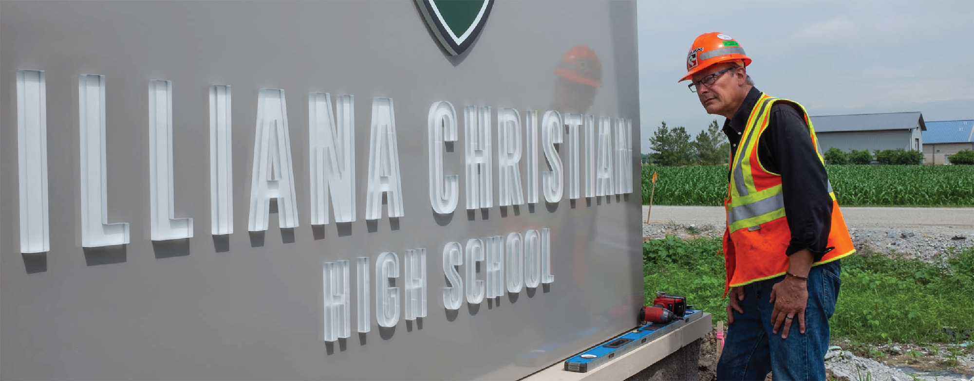
We’ve all shopped around and tried out new companies we were unsure of. It can be frightening entrusting your business to complete strangers. So, what is it that makes us gravitate toward one unknown company over the other? At Roeda, we believe a large part of this is due to how we perceived them at our first impression. One of the biggest impressions a company can make is through their signage. A quality sign reflects both a quality company and team. That sign is the initial ‘handshake’ a customer receives before even speaking to a representative. This being said, you want that handshake to be firm, confident and impressive. In shorter terms: You want a quality sign.
To get some insight on this topic, we sat down with Rodney Roeda, Director of Signs at Roeda.

First off, what makes a quality sign?
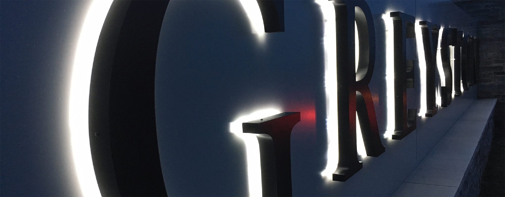
Rodney: A company’s sign should have maximum impact. It needs to be easily understandable and recognizable in a very short amount of time, so you can instantly impact both potential and current customers. At the end of the day, it needs to quickly and clearly show exactly what you do or sell.
Why do you feel signs are a necessity for companies?
Rodney: Signs are a huge part of marketing your company. They act as the literal ‘face’ of you company that is perceived by your audience. They build awareness, show the community who you are, and ultimately are a bridge to increasing both your client base and income. That’s what every company is looking for.
What are the bare minimums a sign should have to make the best impact?
Rodney: Your logo and contact information are a great start! Since this is the first impression a lot of people may be getting of you, you want to convey all of the pertinent information that explains exactly who you are, and what you do/sell.
What are some major mistakes people tend to make with their signage?
Rodney: A common mistake I often see is signs that are just way too busy. People think they need to stuff every little thing they can into their sign, and that’s not the case. Things like too much copy or elements that are sized too big can have a negative impact, and just make it harder to comprehend. Another key mistake is when composition is not taken into consideration. A great composition, mixed with the right graphics and messaging, is always a win.
Do you have recommendations on ways to take a sign to the ‘Next level’?
Rodney: Like I mentioned, layout and composition can really take a sign to the next level, and grab the attention you’re looking for. Really thinking about things like color choice or message can take a good sign to a great sign. Don’t rush it because then you start to skip these important decisions in hope of getting a sign done faster. Getting your sign done faster is never a good substitute for making a sign that has the most possible impact.
With decades of experience under our belt, and a team of designers and installers, the Roeda team knows what it takes to make a sign that works effectively while looking great. Our job is done when we know we’re helping your company get recognized. Give us a call for your next sign.